The Neuroscience of Color: How the Brain Transforms Light Into Emotion
- Rossi Kelton
- 1 day ago
- 5 min read

By Rossi Kelton | Rossi Kelton Fine Art Gallery
August 11, 2026
Color seems effortless. We open our eyes and encounter blue skies, green landscapes, golden sunlight, flowers, shadows, and reflections dancing across water.
But what we experience as color is far more extraordinary than it appears.
Color is not simply something that exists on the surface of an object. Our experience of color emerges through a complex interaction among light, the eye, the brain, surrounding colors, memory, environment, and perception.
For an artist, that distinction is profound.
When I place one color beside another, I am not simply applying pigment to a surface. I am creating visual relationships that the viewer's brain must interpret.
Color doesn't simply exist on the canvas. Color happens within the viewer.

How Does the Brain See Color?
Color vision begins when light enters the eye and reaches the retina.
The retina contains three principal classes of cone photoreceptors with different, overlapping sensitivities to wavelengths of visible light.
But our eyes do not simply take a photograph and transmit it to the brain.
Visual information begins being compared and processed almost immediately. Neuroscience describes opponent mechanisms broadly associated with red–green and blue–yellow differences, along with information about brightness.
Those signals continue through the visual system toward the cerebral cortex, where increasingly complex processing contributes to the experience we call color.
A major review published in Nature Reviews Neuroscience describes color as an integral part of visual processing, with color-selective responses appearing even within early stages of cortical vision.
In other words:
We don't simply detect color. Our brains interpret it.
The Same Color Can Look Completely Different
Here's a simple experiment.
Imagine a gray square placed against white.
It may appear dark.
Now place exactly the same gray square against black.
Suddenly, it appears lighter.
The color itself hasn't changed.
The visual context has.
This phenomenon is enormously important to painting.
Colors influence neighboring colors. Brightness affects perceived saturation. Warm colors can appear to advance toward us, while cooler relationships can contribute to sensations of distance and atmosphere.
Artists explored many of these perceptual effects centuries before neuroscience could explain their biological mechanisms.
The canvas therefore becomes much more than a collection of colored surfaces.
It becomes a perceptual environment.
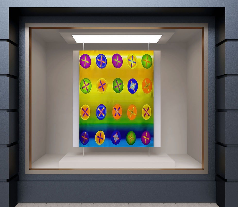
Why Are We So Drawn to Blue?
Blue offers a fascinating intersection between art, psychology, nature and neuroscience.
Psychologists Stephen Palmer and Karen Schloss proposed the Ecological Valence Theory of human color preference.
Their research, published in the Proceedings of the National Academy of Sciences, suggests that our preferences for colors are influenced partly by our emotional responses to things associated with those colors.
Think about blue.
Blue is frequently associated with:
clear skies, clean water, oceans, lakes, distance, open space
Our response to blue may therefore involve far more than the wavelength of light reaching our eyes.
It may carry associations accumulated through nature, memory, culture and personal experience.
Water Is Never Simply Blue
This becomes especially interesting when painting water.
Look closely at a lake, ocean or river and something remarkable happens.
Water rarely has one fixed color.
It reflects:
sky
vegetation
sunlight
clouds
atmosphere
surrounding objects
depth
movement
A body of water can shift from blue to green, silver, violet, gold, gray or nearly black within a single visual field.
And the viewer's brain continuously interprets those relationships.
This is one reason water remains such an important subject within my own paintings.
I am not simply interested in painting water.
I am interested in painting what happens when light encounters water.
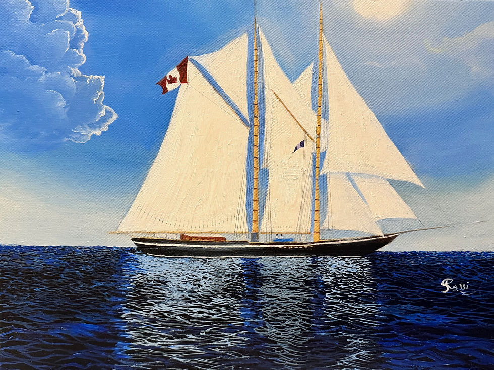
Color, Memory and Emotion
Color can also become deeply personal.
A particular blue might remind someone of an ocean visited during childhood.
Green might recall a garden.
Gold might evoke sunset.
Another person may experience those same colors completely differently.
Research into color preference supports the idea that color associations can be influenced by personal, social and cultural experience.
That means two people can stand before exactly the same painting and experience something different.
That difference doesn't diminish the artwork.
It helps complete it.
The artist establishes the visual conditions.
The viewer brings memory, association, expectation and emotion.
Does Red Really Mean Passion and Blue Mean Calm?
Popular discussions about color psychology frequently reduce color to simple formulas:
Red = passion
Blue = calm
Yellow = happiness
Human perception is much more complicated.
Our responses to color can depend upon context, brightness, saturation, surrounding colors, previous experience, culture and the environment in which we encounter it.
A deep blue-black sea, for example, may feel mysterious or uncertain.
A luminous turquoise may suggest openness.
A pale blue gray can create atmospheric distance.
An intense ultramarine surrounded by orange may feel visually electric.
Meaning emerges through relationships.
For artists and interior designers, this distinction is particularly important.
Choosing color isn't simply choosing a hue.
It is creating an experience.
Light Changes Everything
Color cannot exist visually without light.
And light continually changes our experience of color.
This becomes especially apparent in artwork incorporating reflective surfaces, resin, transparent layers, glazing, metallic elements or highly saturated pigments.
Walk across a room and a reflection changes.
Move closer and a transparent layer appears.
Step backward and individual marks combine into an atmospheric field.
Morning daylight may reveal something different from evening illumination.
The artwork hasn't physically become another painting.
But our experience of it has changed.
Artwork exists in a continuing dialogue between:
Light + Surface + Color + Environment + Viewer
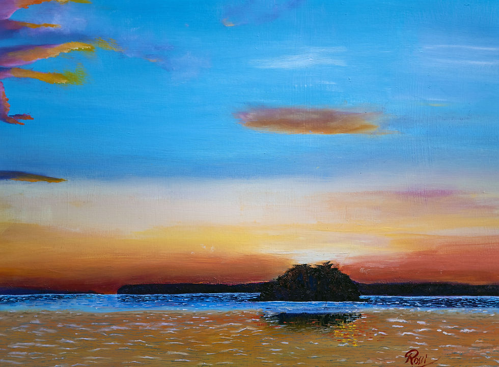
Painting as a Perceptual Experience
This relationship has profoundly influenced my artistic practice.
I am interested not simply in representing what light illuminates.
I am interested in exploring what light does.
Light reflects.
Light obscures.
Light reveals.
Light changes color.
Light creates atmosphere.
And perhaps most importantly:
Light changes perception.
Whether I am painting reflections across water, atmospheric landscapes or compositions built around simultaneous color relationships, I return to a similar question:
What happens inside the viewer when light and color interact?
Painting becomes one way of investigating that question.
The pigments are physical.
The canvas is physical.
The light striking the painting is physical.
But the final visual experience exists within the observer.
That is where neuroscience and painting unexpectedly meet.
The Viewer Completes the Painting
Perhaps one of the most beautiful implications of the science of color is that seeing is participatory.
The artist can arrange pigments.
The artist can manipulate contrast.
The artist can create reflections, transparencies, luminosity and chromatic relationships.
But the artist cannot physically place the final experience into the viewer's mind.
The visual system must construct it.
Every painting therefore becomes an encounter between two systems:
The visual language created by the artist
and
The perceptual system brought by the viewer.
Perhaps that is why certain paintings continue revealing themselves long after we first encounter them.
The painting may not have changed.
We have continued to see.
Explore Art Through Light and Color
Rossi Kelton Fine Art Gallery explores the relationship among light, color, water, atmosphere and visual perception through contemporary painting.
Explore original paintings, optical color studies and atmospheric works created to change not simply what we see—but how we experience seeing.
For Interior Designers: Explore the Designer Trade Program →
References
Gegenfurtner, K. R. (2003). Cortical mechanisms of color vision. Nature Reviews Neuroscience, 4, 563–572.
Palmer, S. E., & Schloss, K. B. (2010). An ecological valence theory of human color preference. Proceedings of the National Academy of Sciences, 107(19), 8877–8882.
Schloss, K. B., Strauss, E. D., & Palmer, S. E. (2012). Object color associations and color preference. Research examining associations between objects and color preference.
© Rossi Kelton Fine Art Gallery


Comments